Macro Notes - Key Differences Between Now and the 2000 Tech Bubble
October 21, 2025
Both of the below charts make important comparisons between the top US tech firms on the eve of the “Tech bubble” in March 2000 and the Mag 7 firms of today.
Chart 1 shows the market-cap weighted free cash flow for both. This gives us a sense for what portion of capital expenditures are funded from operating cash flows versus external financing (debt or equity). The large blue bar for today relative to the ‘Tech Bubble’ tells us that current levels of AI-related capex are being funded endogenously.
This is a good thing - as the current AI spending boom isn’t leveraged.
Chart 2 shows the market-cap weighted Capex/EBITDA ratio for both. This gives us an idea for how much of a firm’s earnings are reinvested back into capital assets – including AI. Here we see that the difference between the two isn’t as stark as we’d like.
In other words – as commitments to AI-related capex continue to rise, it’s more likely that firms will turn to external financing.
We’re still leaning into the AI capex story with an eye on mid-2026 as a potential inflection point.
Chart 1 – Free Cash Flow for Top US Tech Firms: Now vs. 2000 Tech Bubble
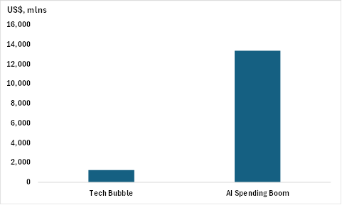
Source: BMO GAM, Bloomberg
Chart 2 – Capex/EBITDA for Top US Tech Firms: Now vs. 2000 Tech Bubble
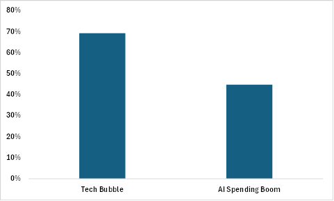
Source: BMO GAM, Bloomberg